Asset Library
User Interface | Graphic Design
Project Overview
The asset library project was for JBA Consulting when I was in the role of the digital designer in the marketing team and was tasked in creating the design of an asset library.
The Problem:
An employee from JBA has always needed to email the marketing team to supply them with any assets needed for projects they were working on, this process needed to be a bit simpler where anyone that was the staff of JBA could view and download a library of assets at anyone’s disposal.
The Solution:
The decision was made to create an interactive document that would serve as a library for assets the marketing team would create, this decision was made by the senior designer and my line manager and was passed down as a design task for me.
The Task:
I was then set the task to design and create this interactive document with full creative freedom as long as it had the company branding. I approached this from a User Interface Perspective and went through the process of the UI process; Wireframing (Sketch > Digital), High Fidelity Mockup, High Fidelity Prototype (Low fidelity stage was skipped as I didn’t think it would be necessary for this project)
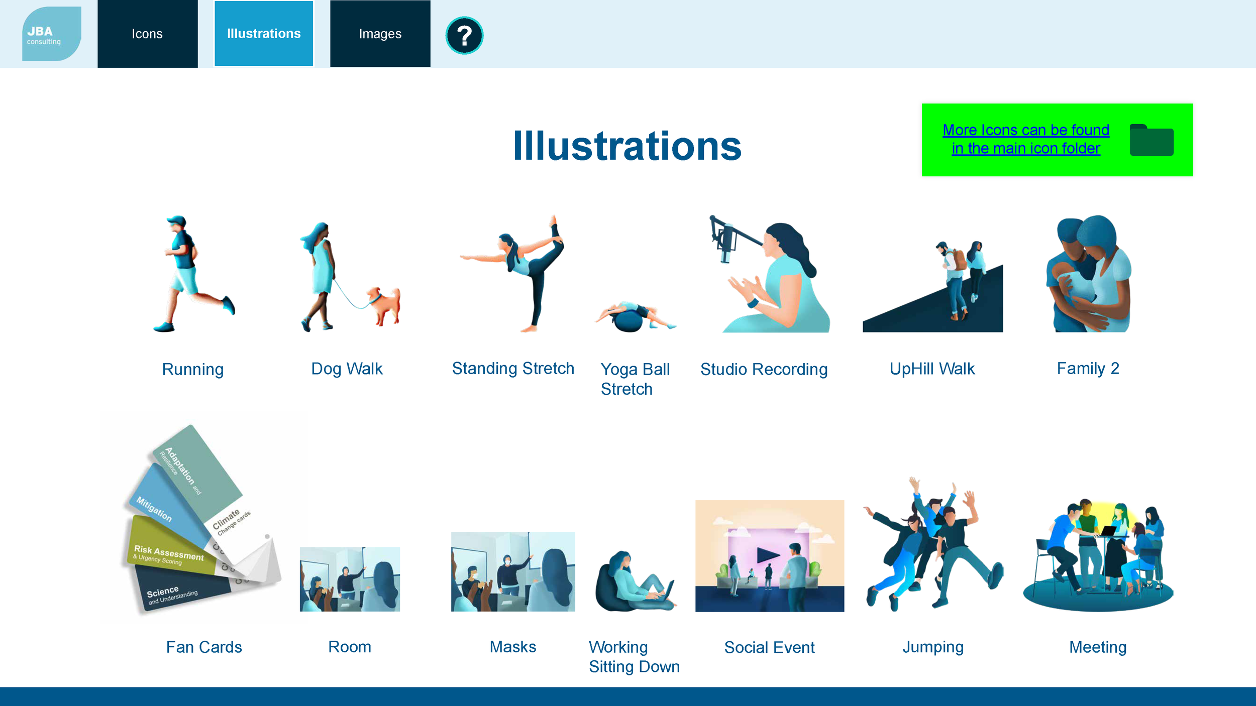
This project had 2 phases, phase 1 was to split the navigation into purely illustrations and icons, after this design was done and after a discussion about the design and who it was for it was decided it would be better if the navigation would go into each sector JBA covered so everyone could look for it per sector. Therefore the design went into each sector then split between illustrations/icons, this is what turned into phase 2 (ones with the sectors) As the basic design was done it was just improving upon it and building on that with feedback. The project then sat as of how phase 2 looks right now and the project wasn’t taken any further whilst I was at JBA.
Improvements:
Upon self-reflection, the one thing I would do differently with the knowledge I have now in comparison to when I had done the project was to do a low fidelity prototype to make sure the User Experience was sound first then move onto design so the basic functionality wasen’t being drowned and distracted by the visuals.


