Cinesnack App Project
User Interface Design | User Experience Design | Personal Project
Project Overview
The Cinesnack app project is a current personal project and was done while I was learning more about UI/UX as this was part of the Google UX Course. Its still work in progress and more development will be added as the project progresses, I wanted to learn more about UI/UX in a structured way so an online course was perfect while learning more about Figma at the same time. The project topic for me was a cinema app to order refreshments through. I started this course in 2021 from courses 1-5 in the programme before having a long break and picking it back up in 2023.
Personas
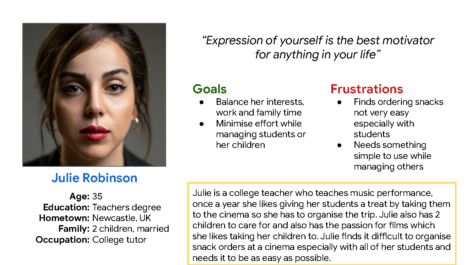
The first step in the project was to create personas for the chosen app. I created 2 personas which cover both male and female with two different sorts of people, a uni student and a college teacher.
User Stories
The next step was putting yourself in their roles shoes and create a user story to determine the type of user, what action they want to take and what benefit they would want.
User Journey
Next to build off from the user story is to again put yourself in their shoes in a series of experiences they would go through when trying to achieve a goal, in my case this is the user ordering snacks for the cinema. This is an important step to ensure that there is no designer bias, so i’m thinking of other users needs rather than my needs. I made one user journey because I the journey was going to be the same with very similar feelings and improvements.
Problem Statements
Next was problem statements which are designed to identify a clear description of a user’s needs. One statement per persona was created in this project.
Hypothesis Statement
The next step was now that we know a bit about the pain points is to make an educated guess how the app will solve one of a few of the target audiences pain points
Competitive Audit
Part of the ideation process is to make sure what your competitors are and what their strengths and weaknesses
Product Goal Statement
The final step for the ideas stage is the goal statement to combine everything so far into one statement. This should describe the product and describe its benefits to is users
User Flow
Now that I have established what the app does and what benefits its needs, I need to take the route of a user and anticipate what actions and decisions they are going to make, this is done via a flow chart.
Storyboard
As well as a user follow we need a storyboard which has more of a visual representation of how the app is going to work, this can be through a scenario or the process of how the app would work to tell a story.
LO-FI Wireframes (Hand-drawn)
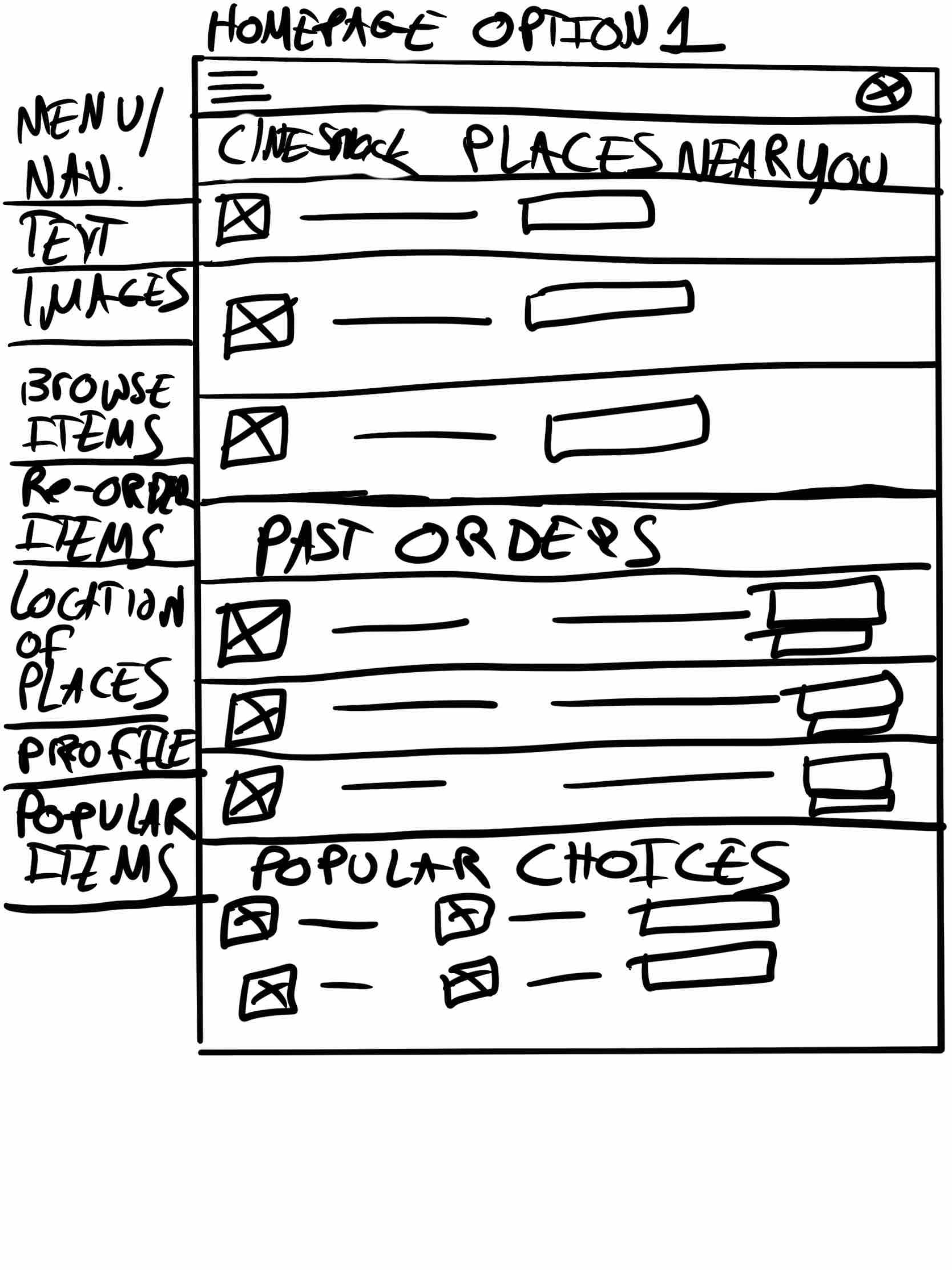
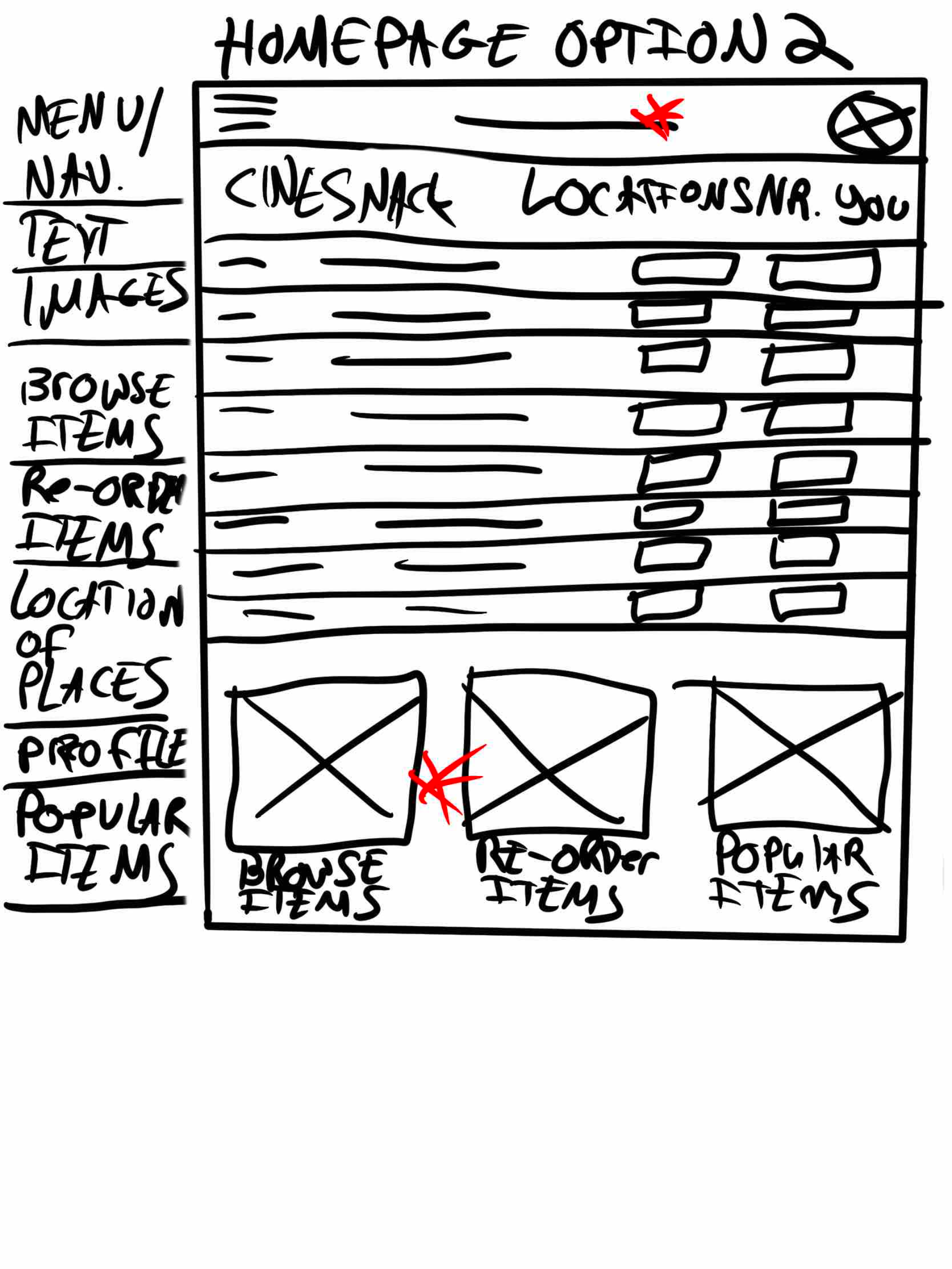
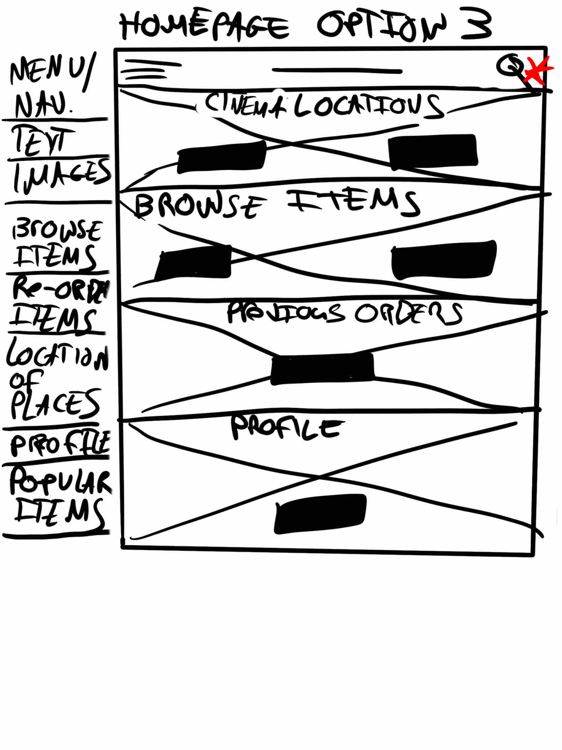
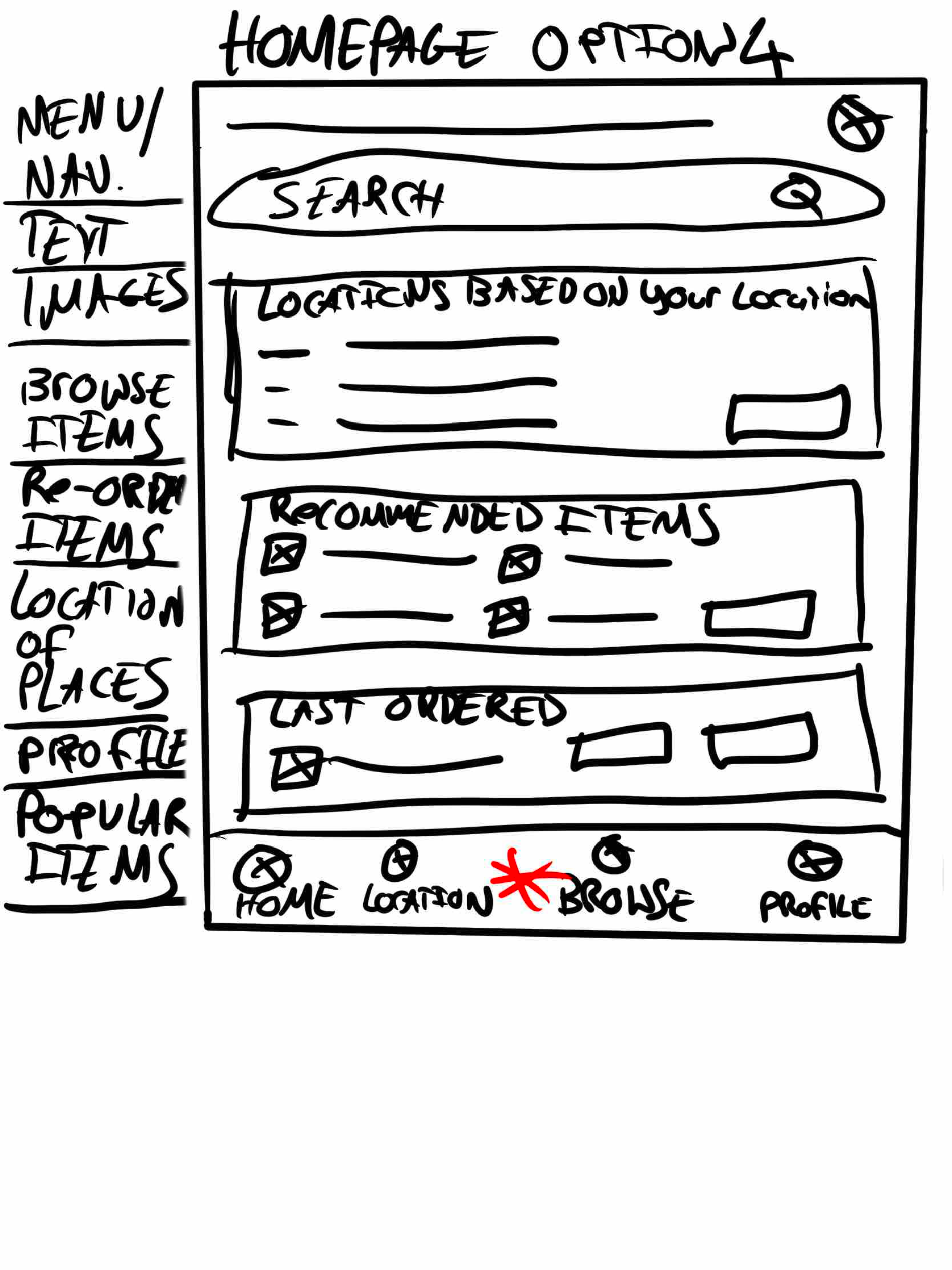
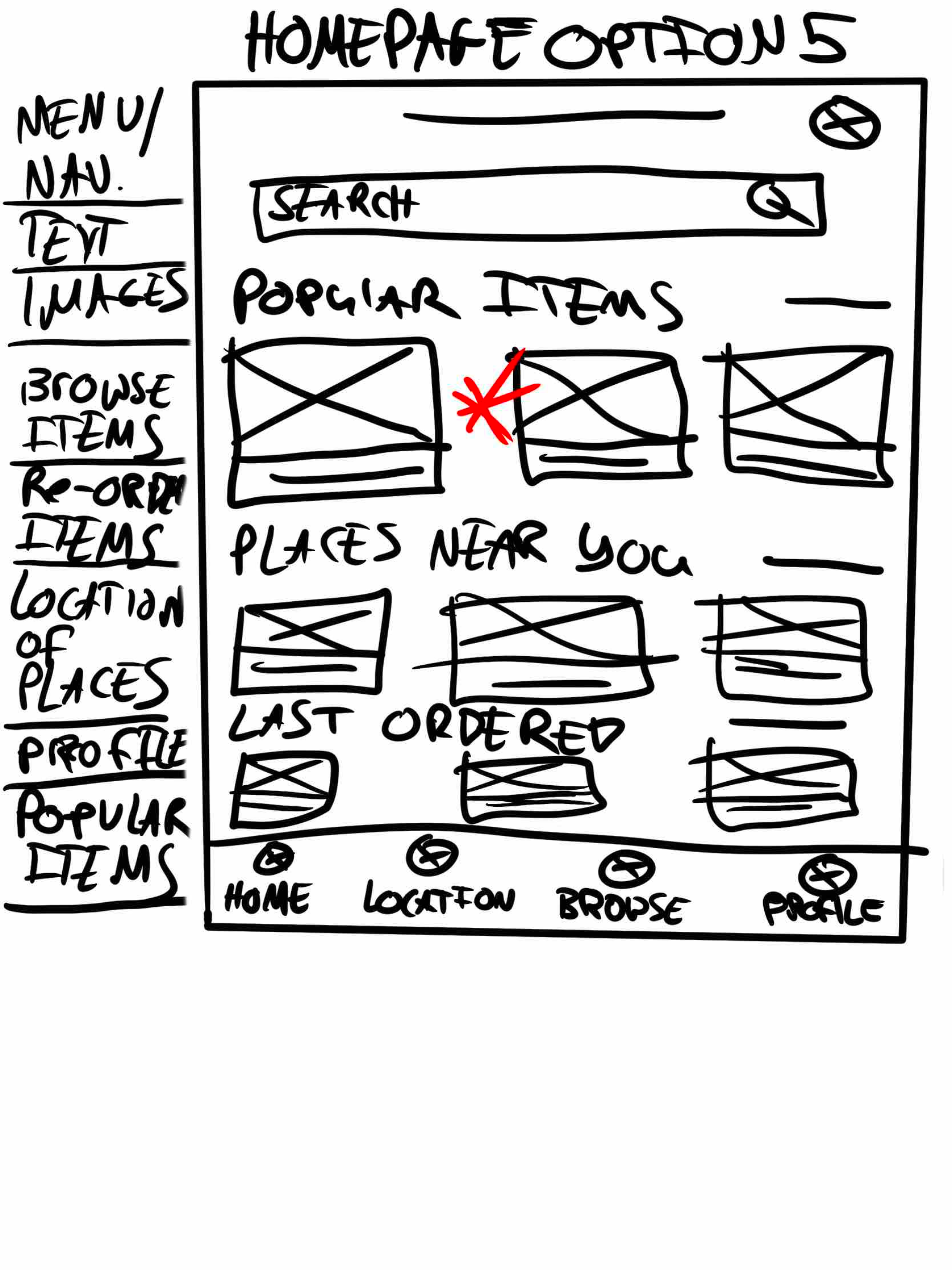
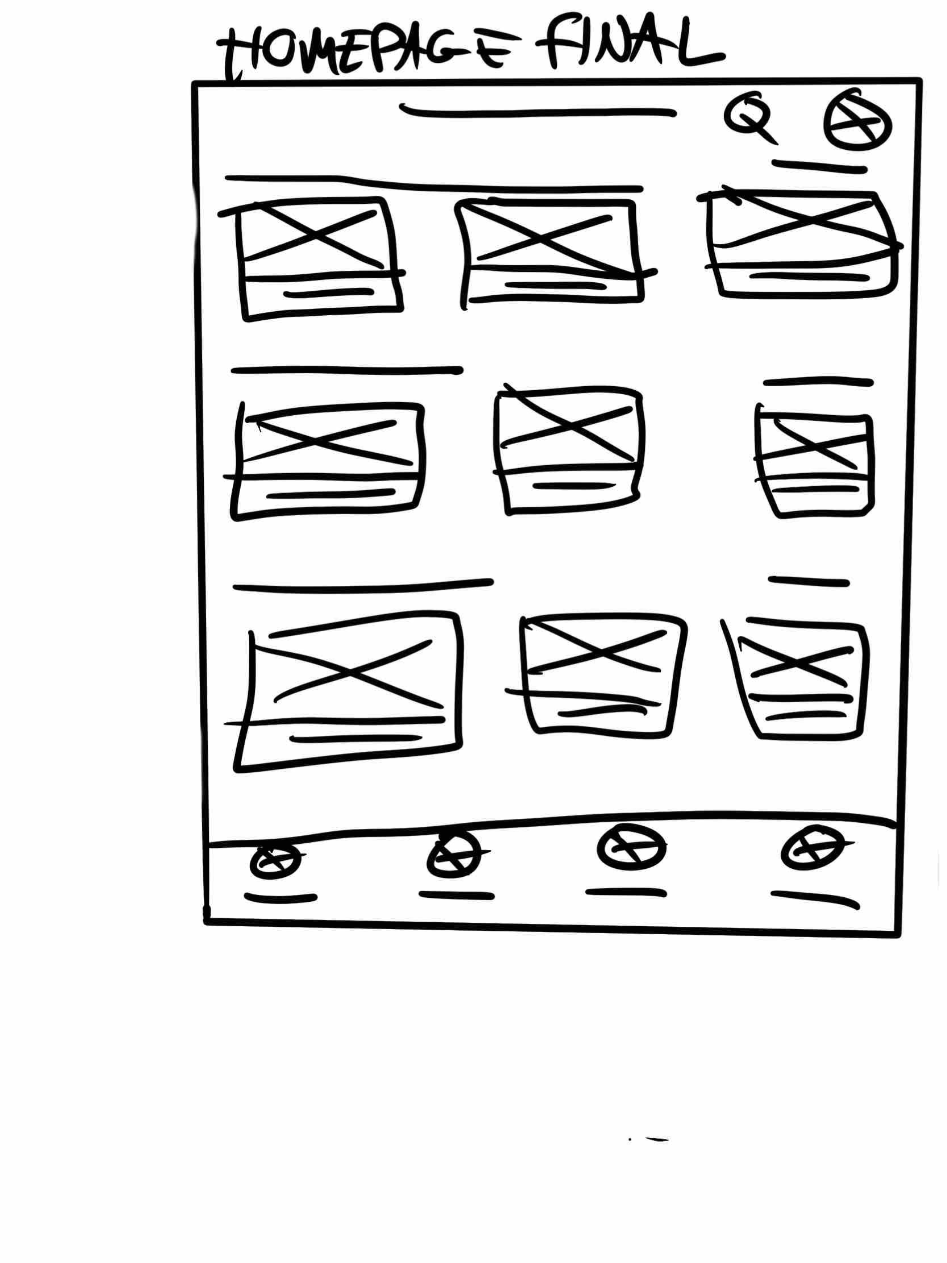
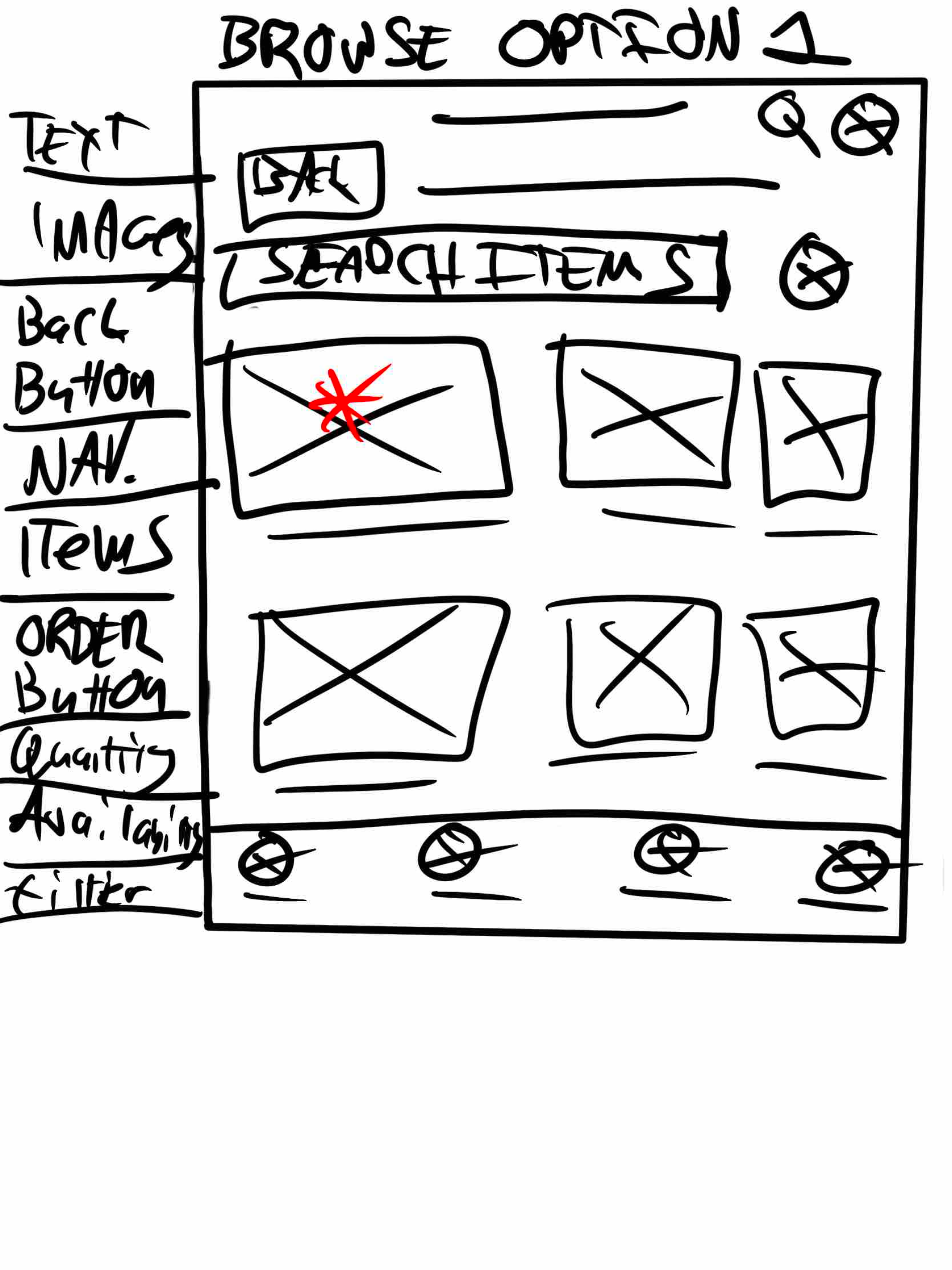
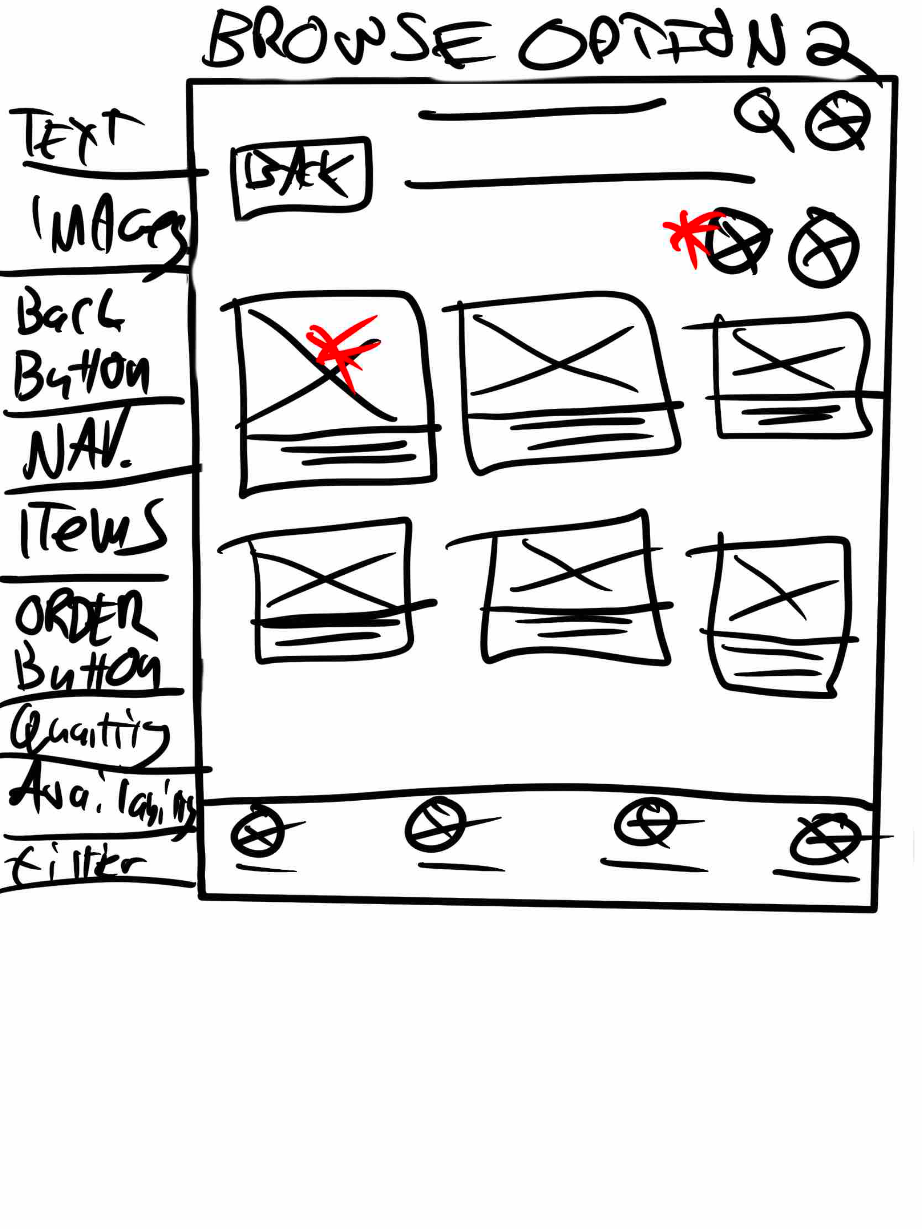
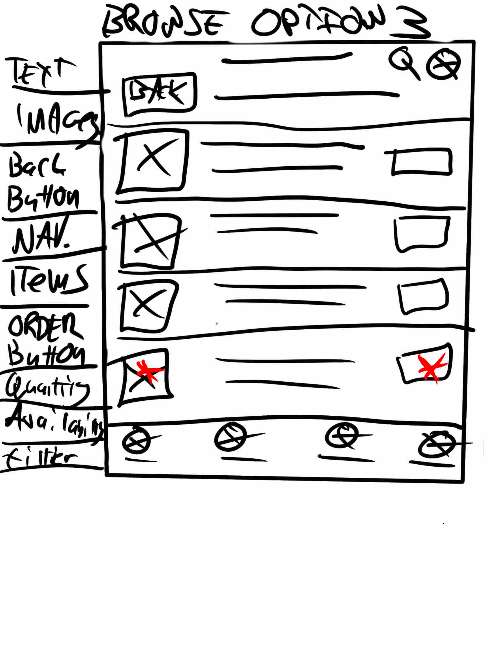
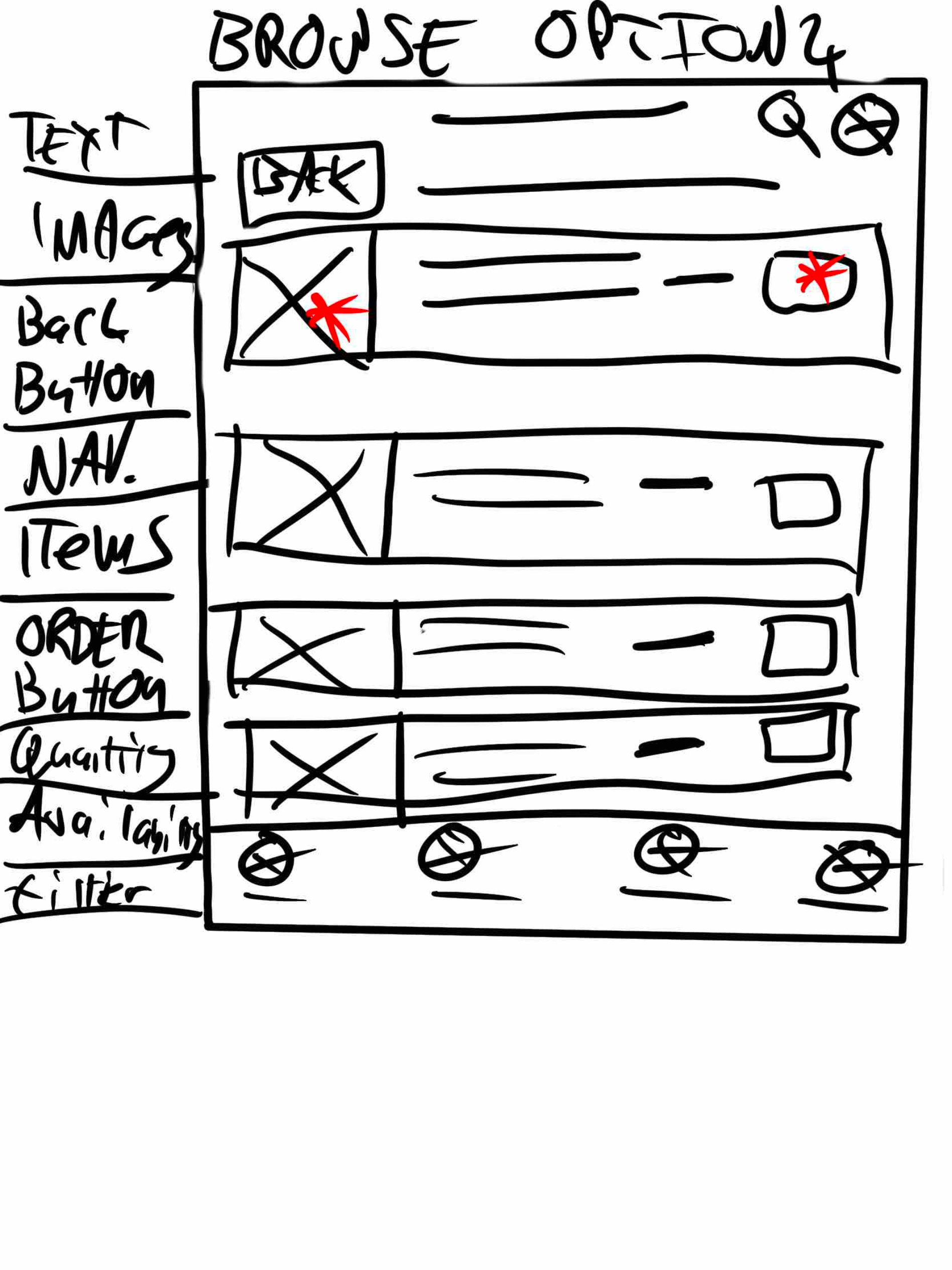
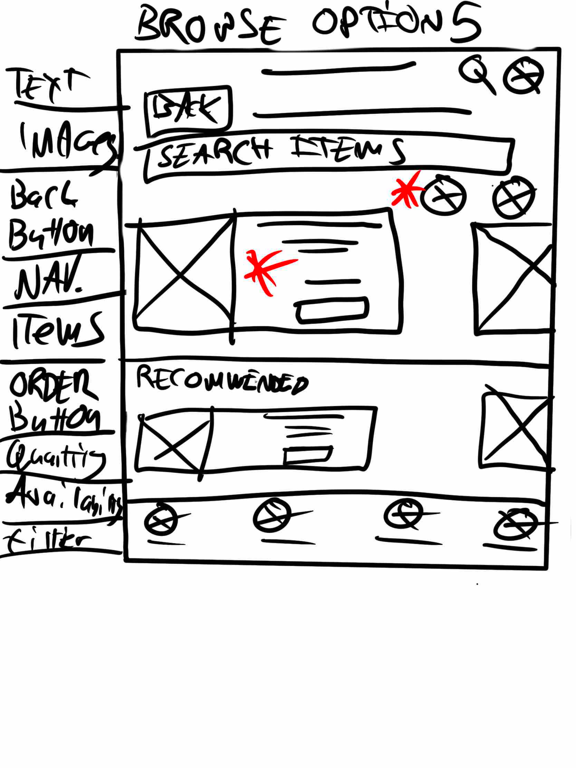
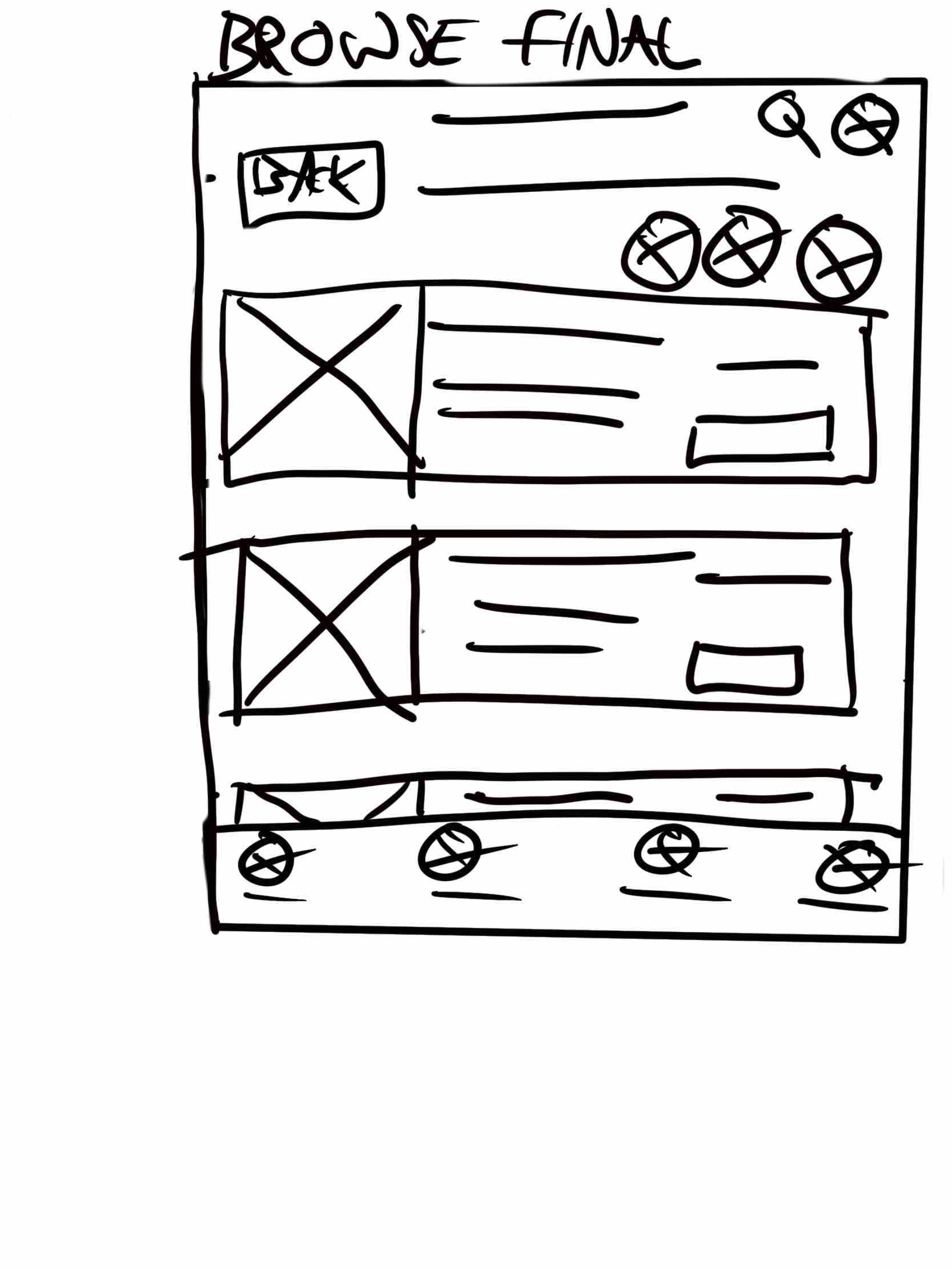
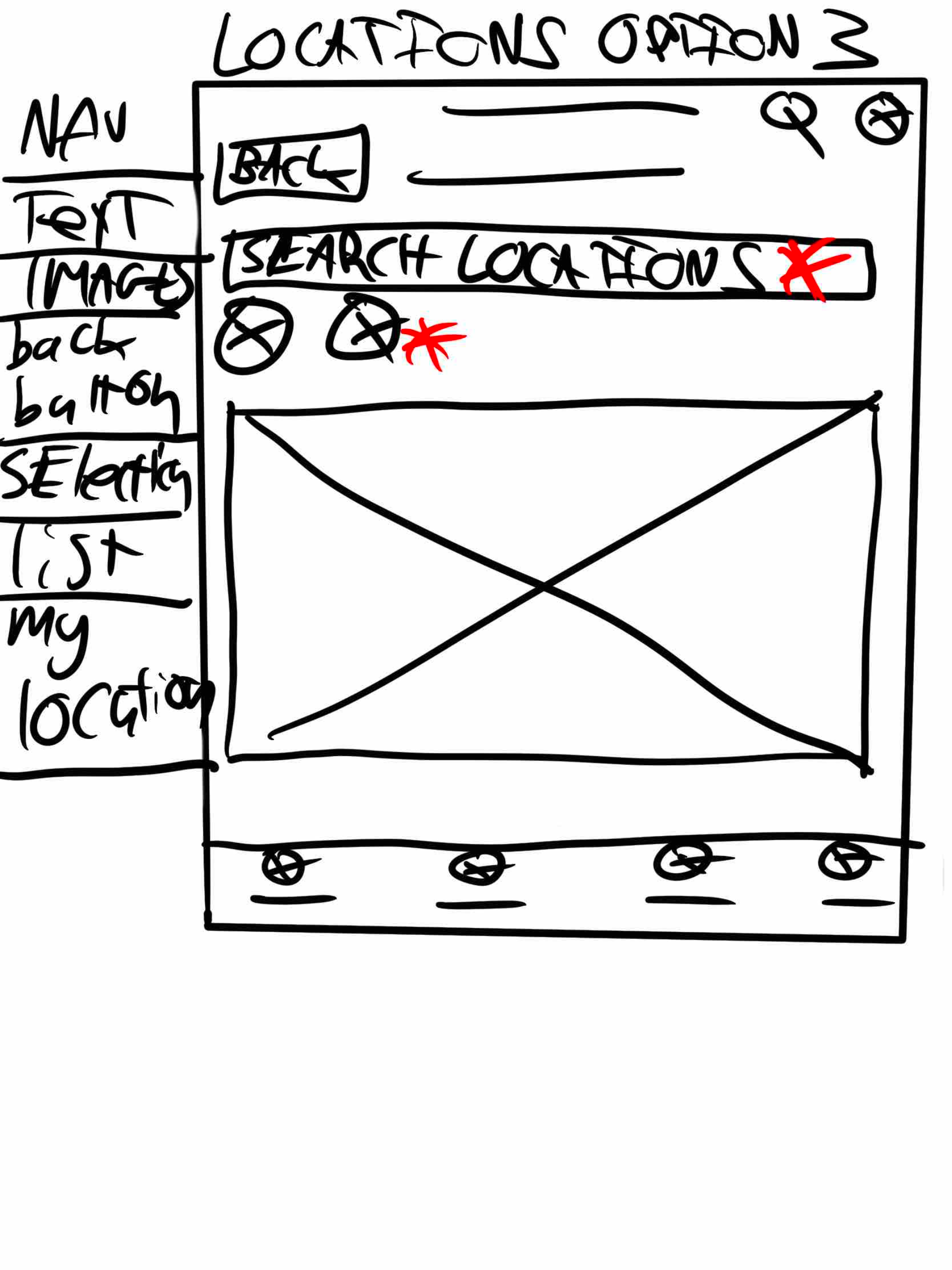
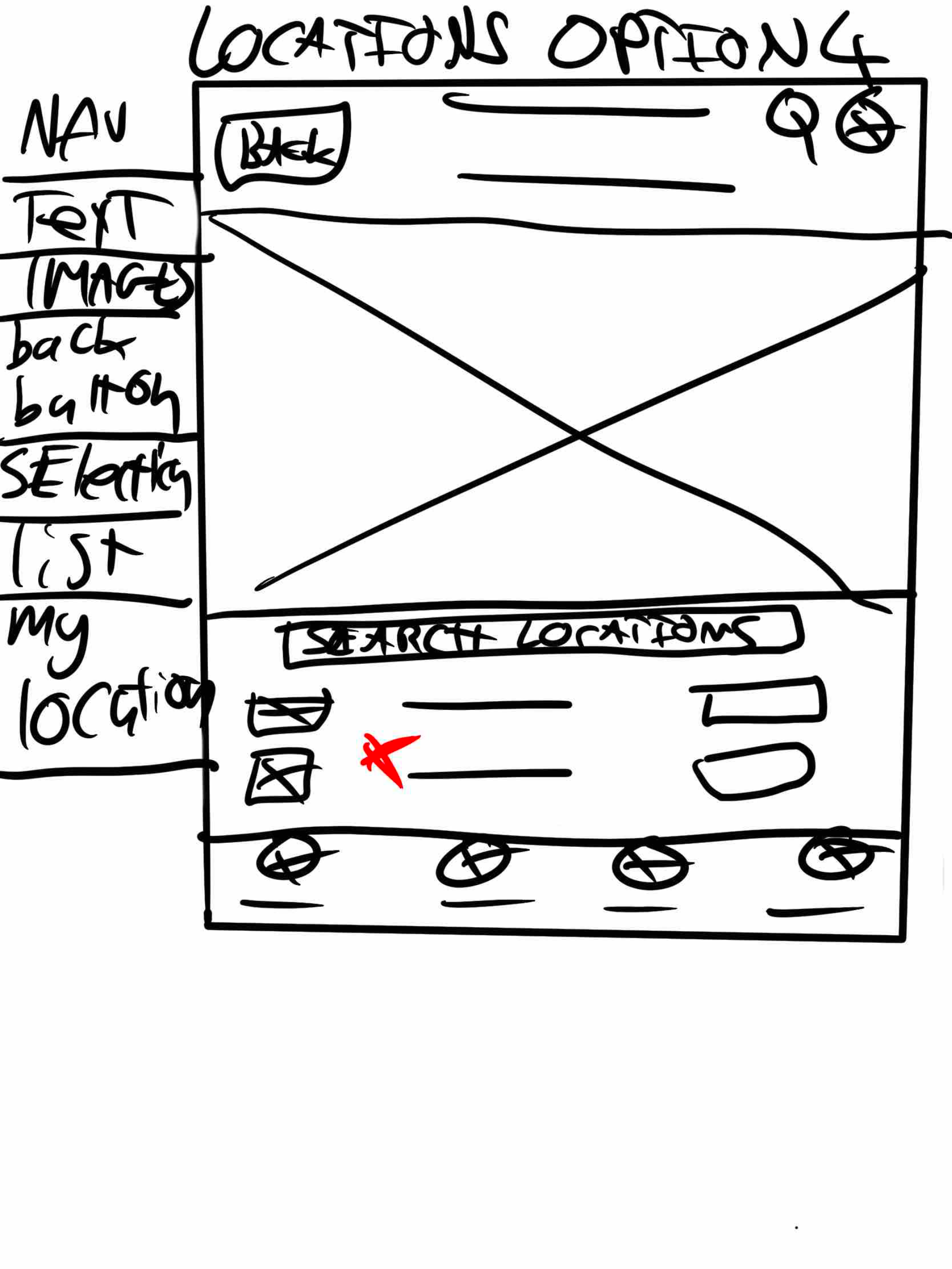
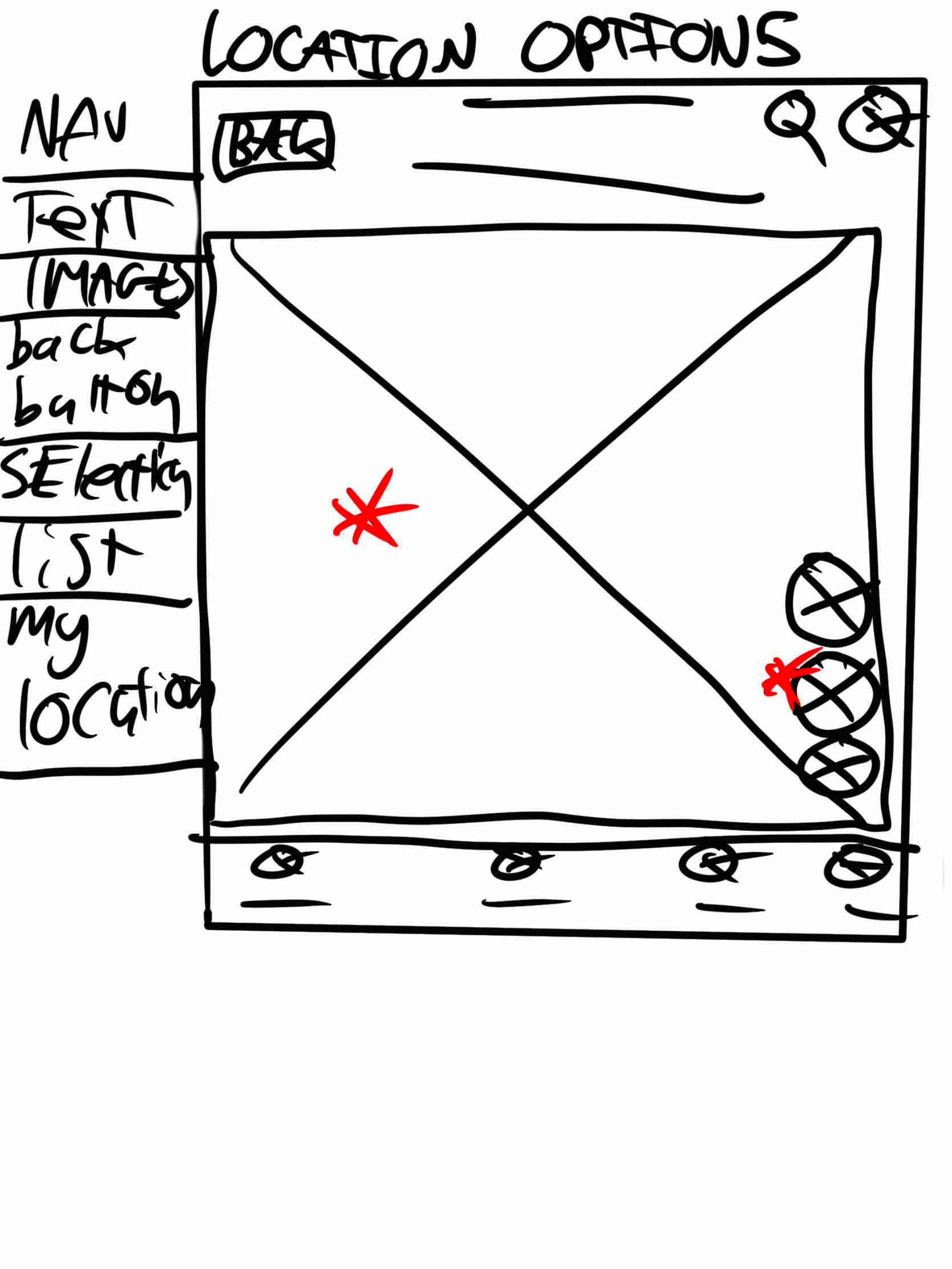
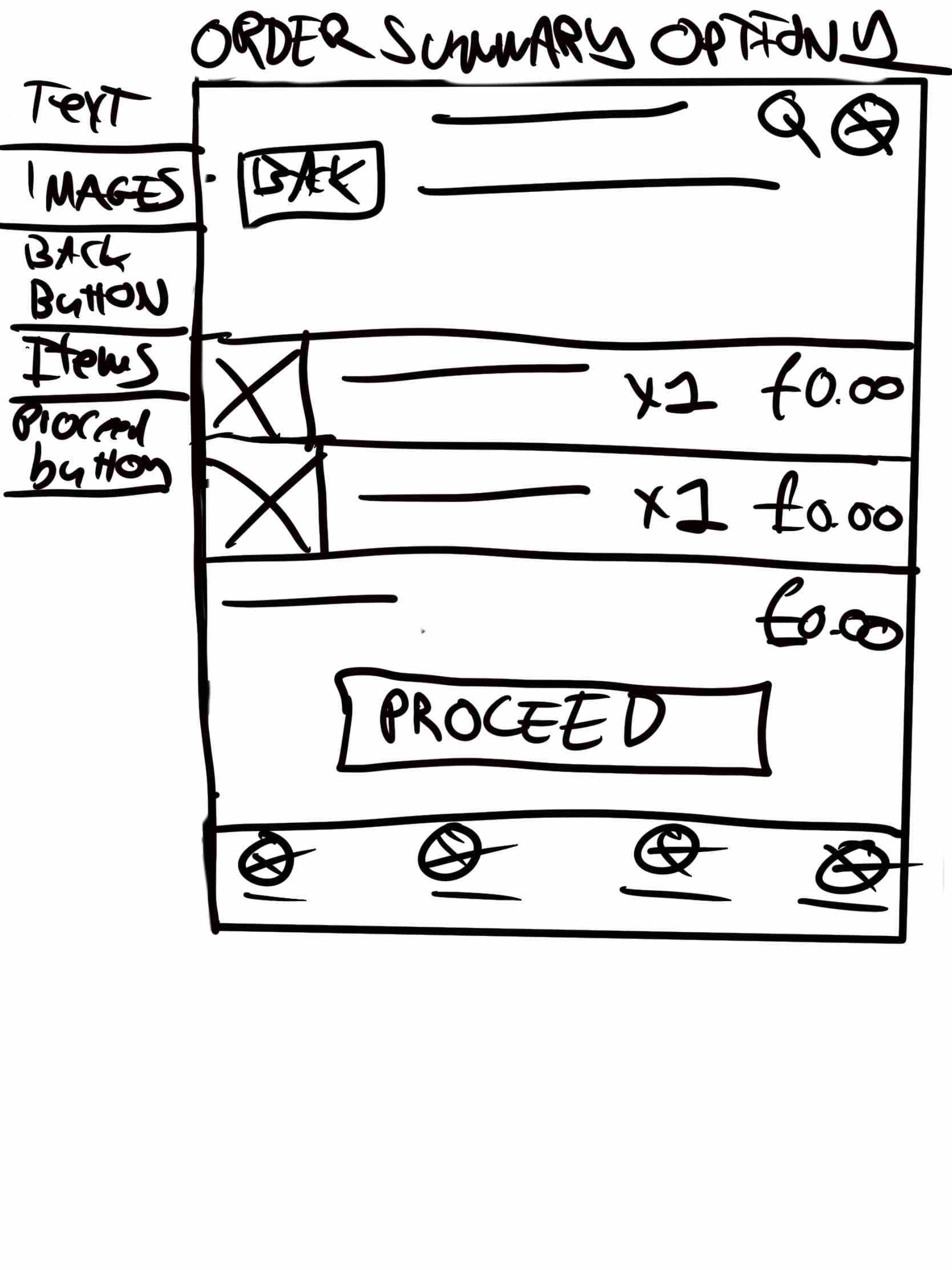
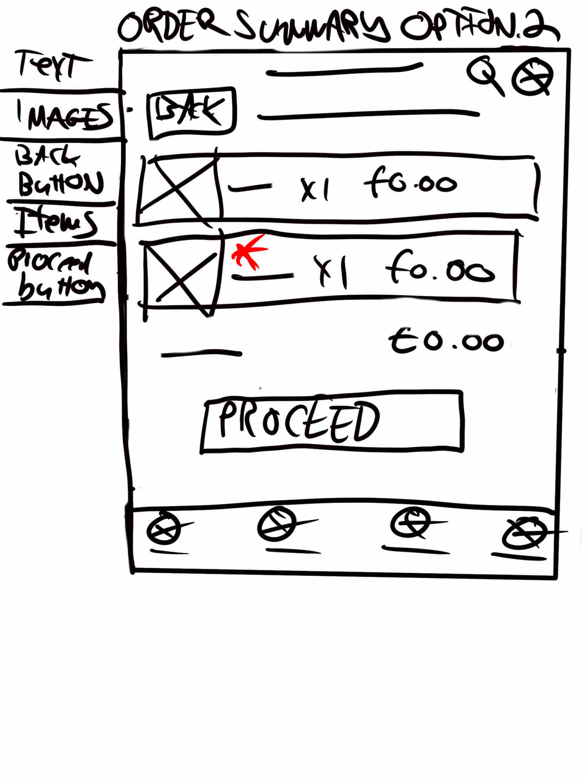
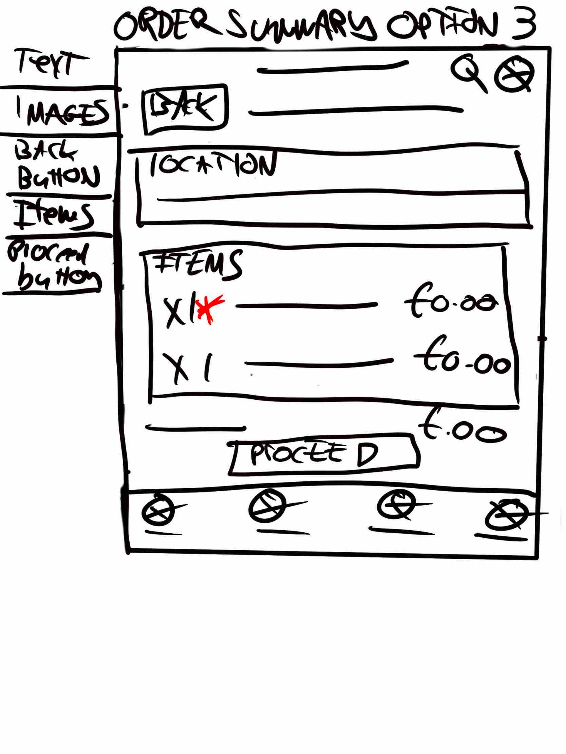
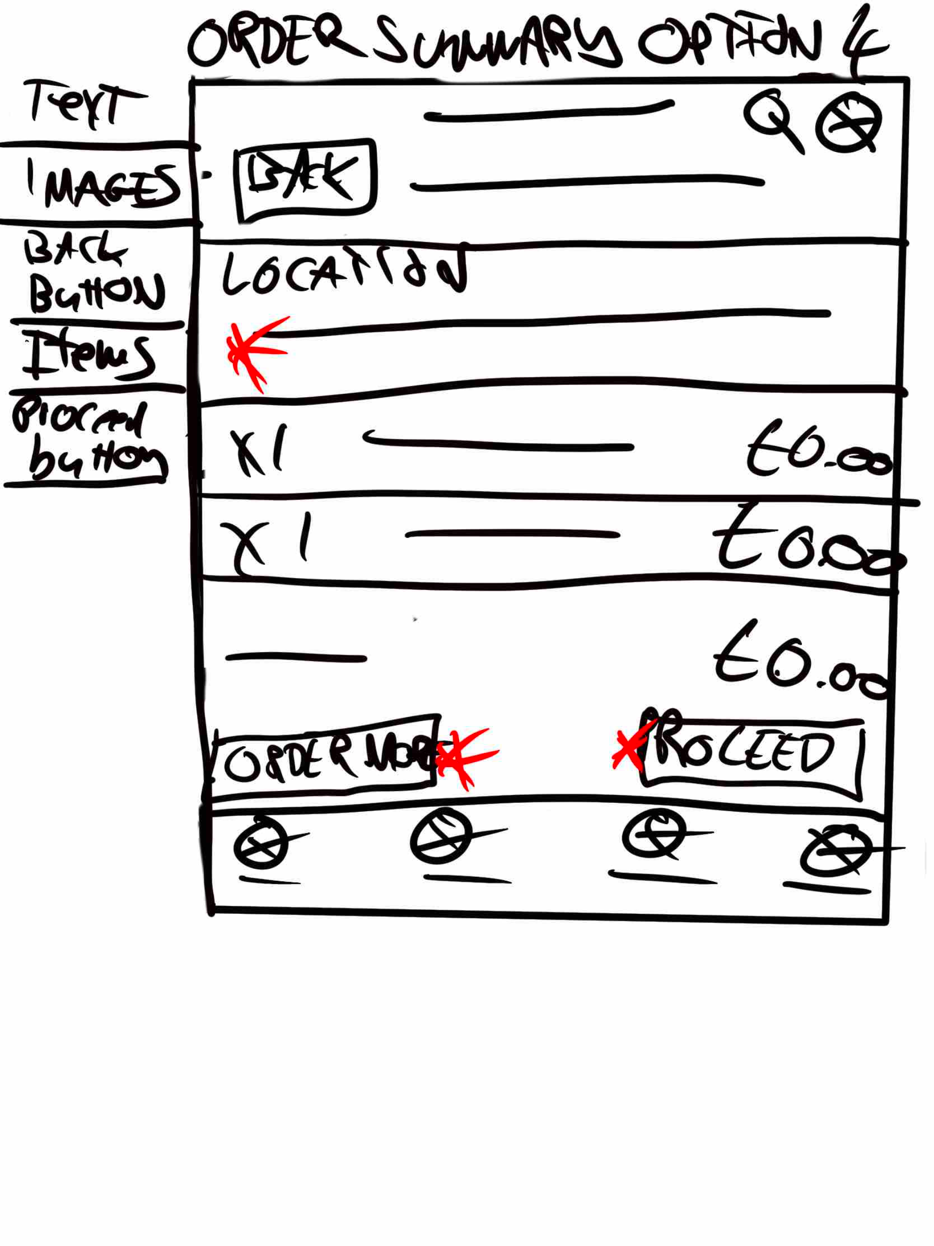
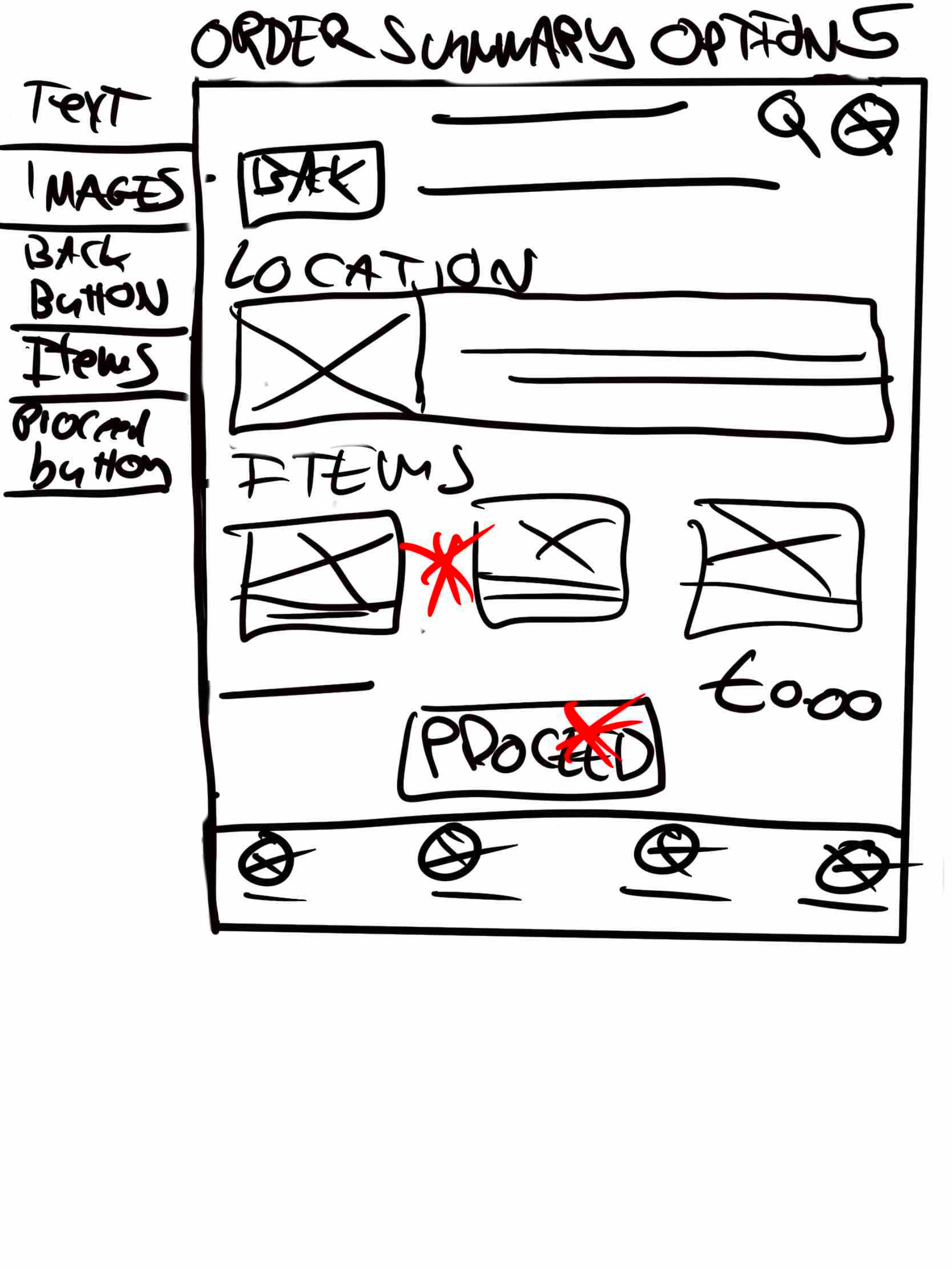
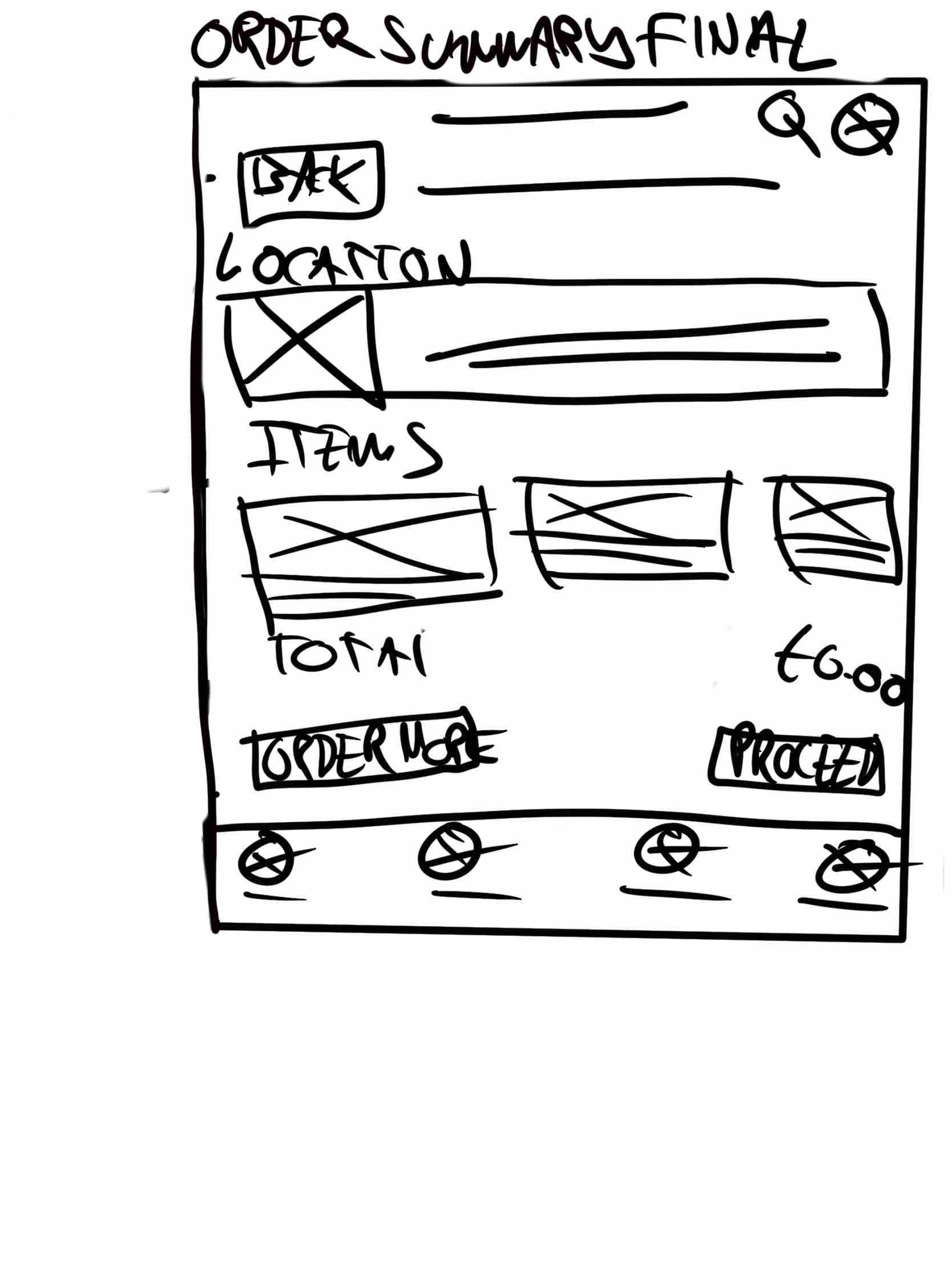
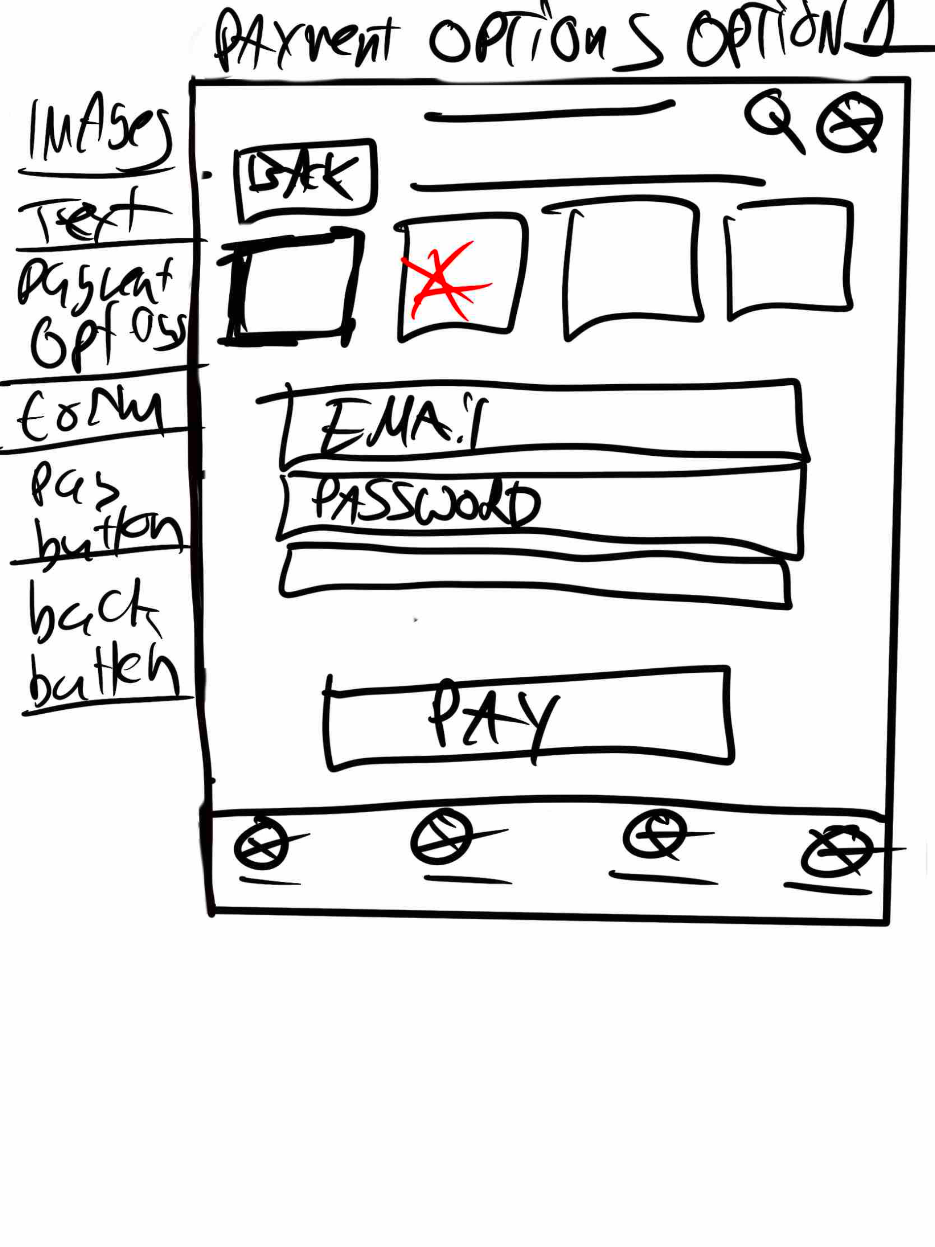
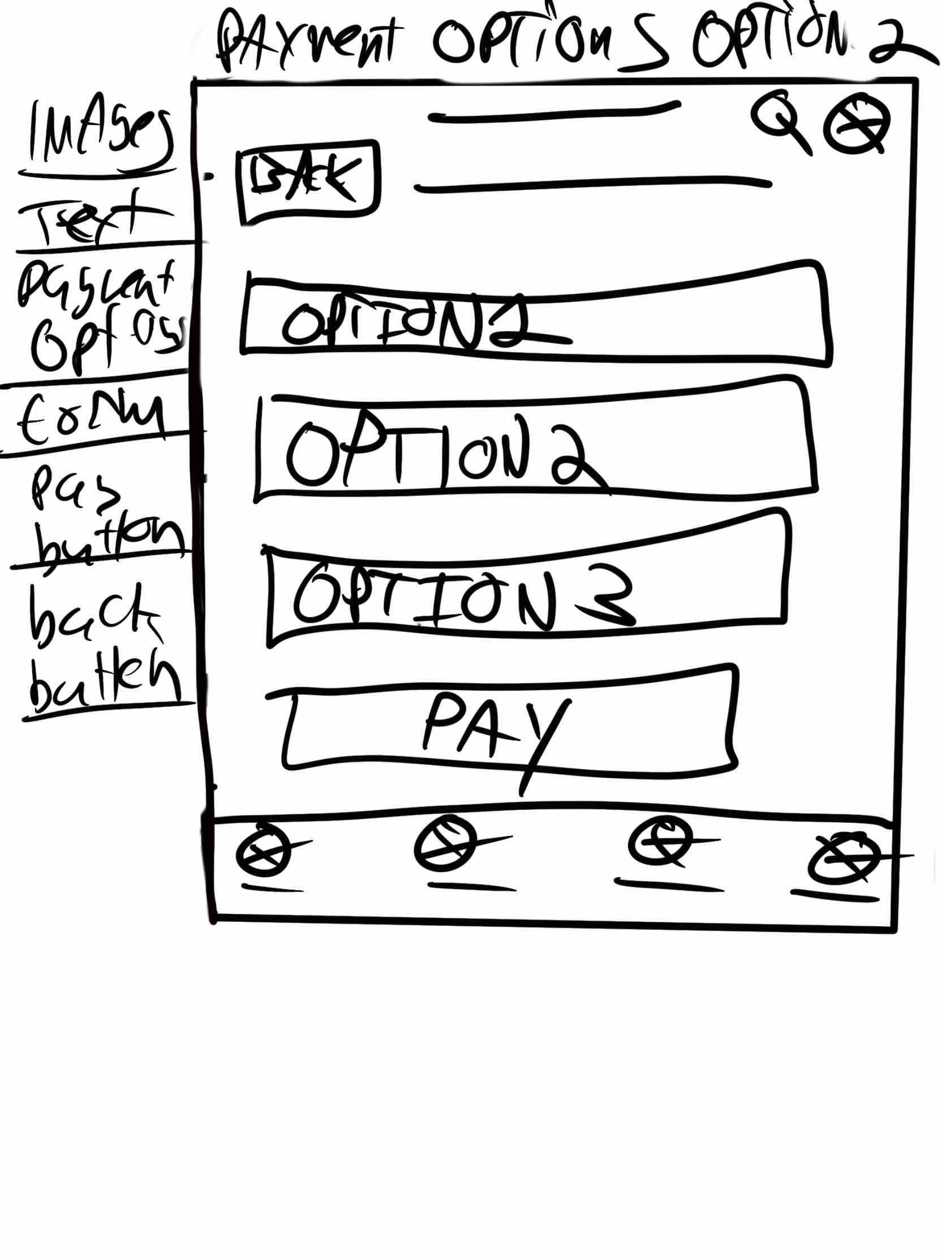
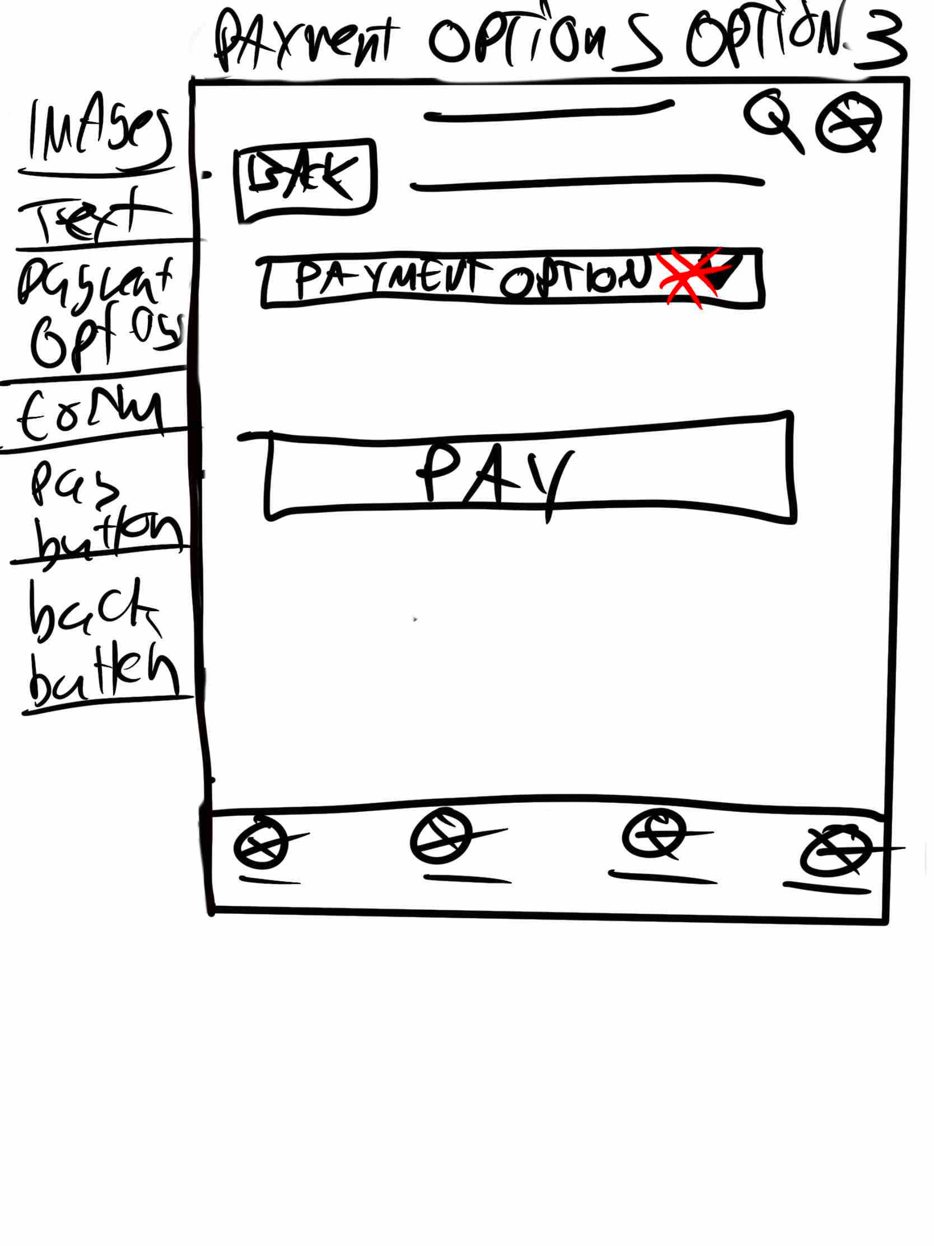
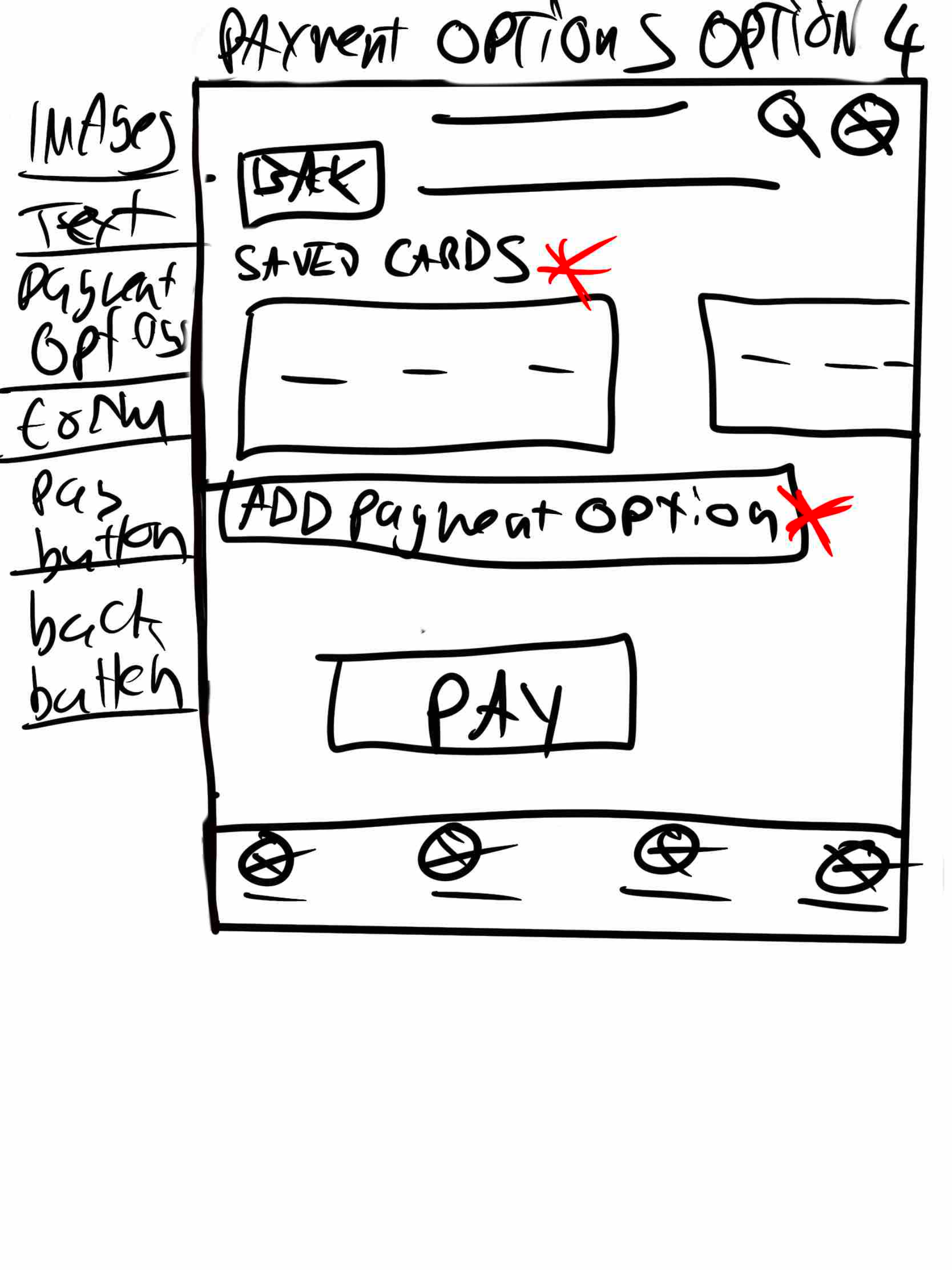
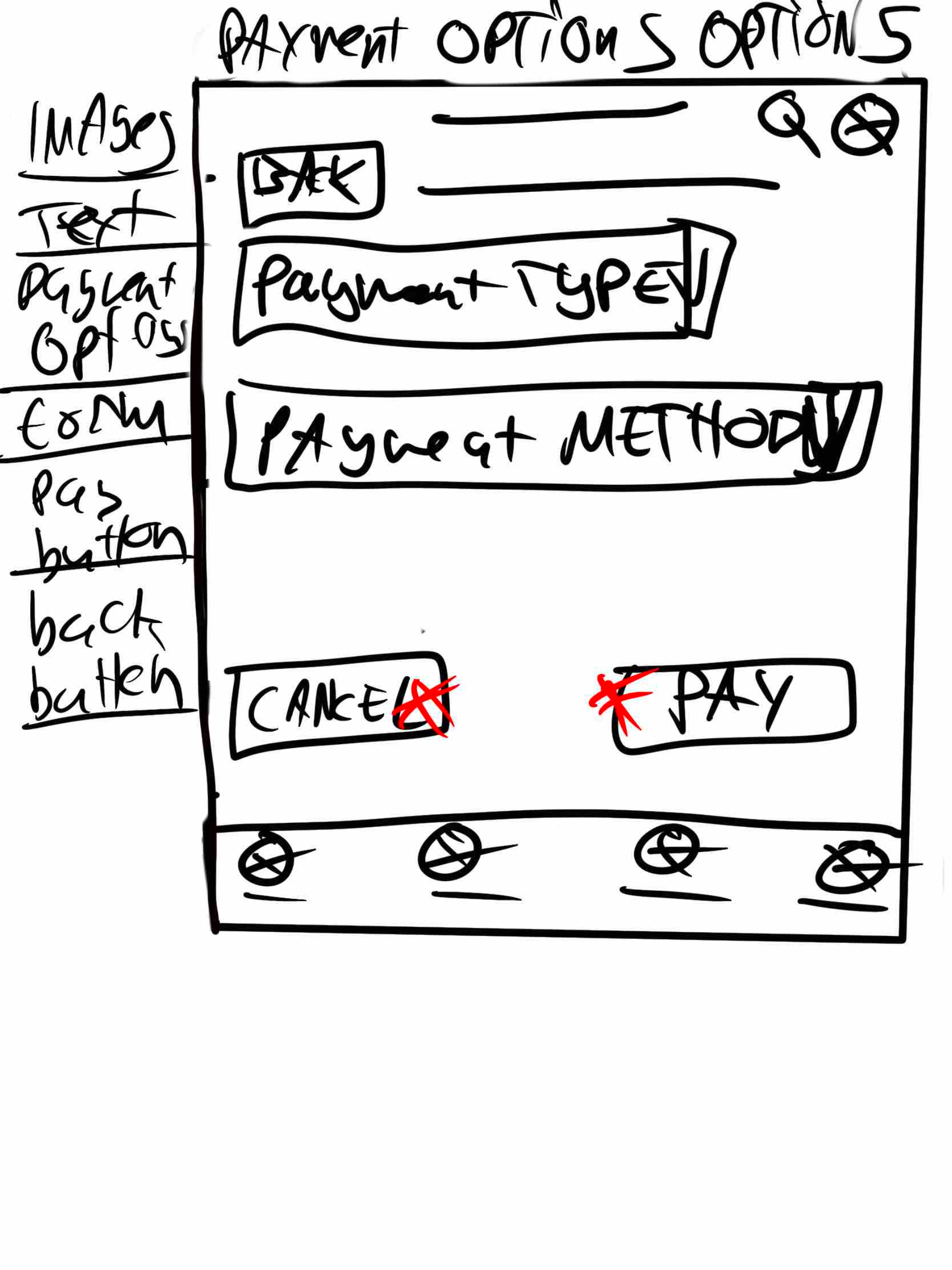
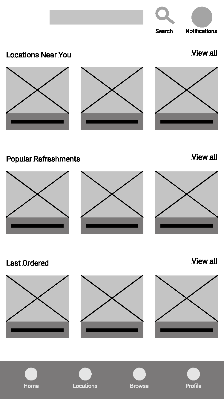
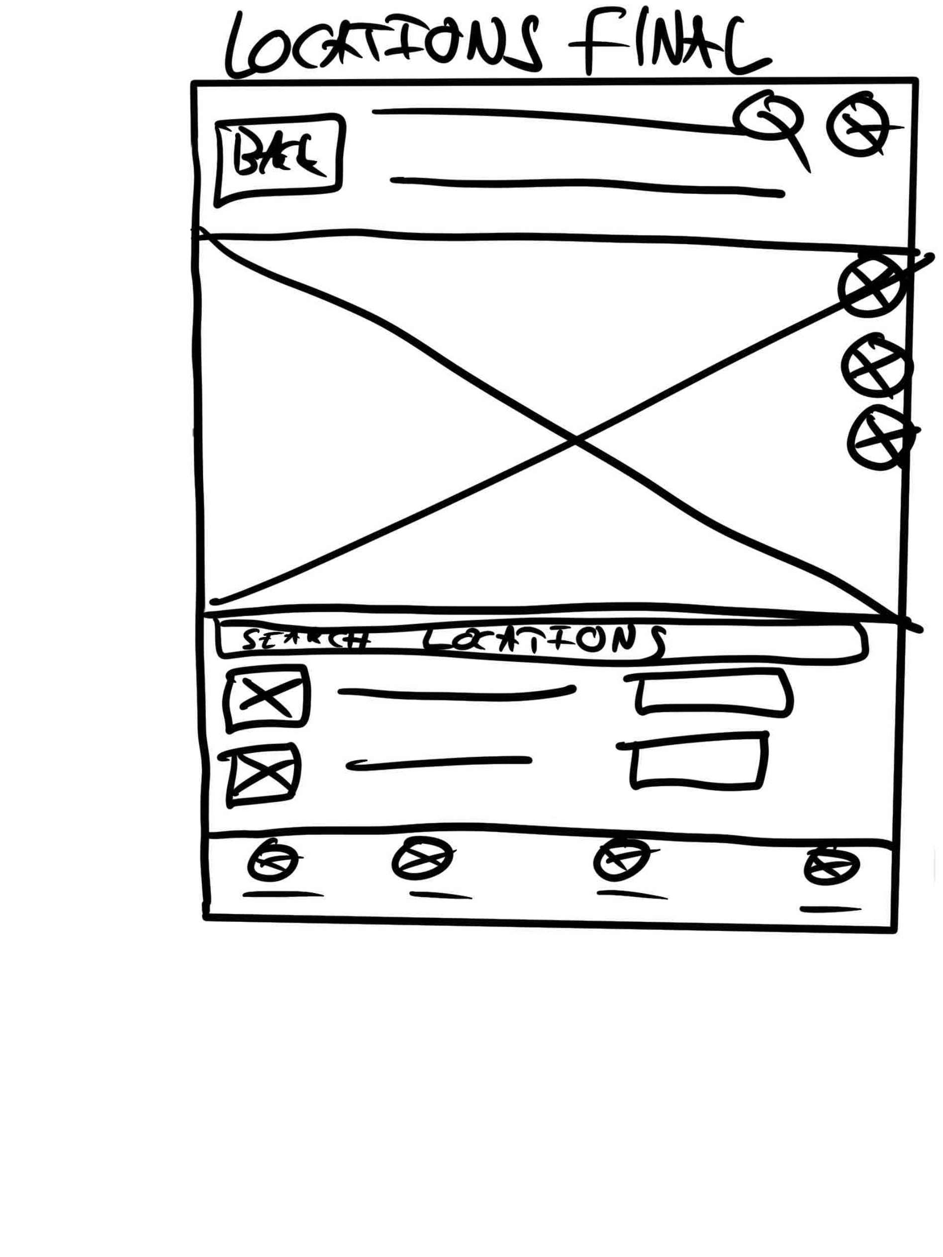
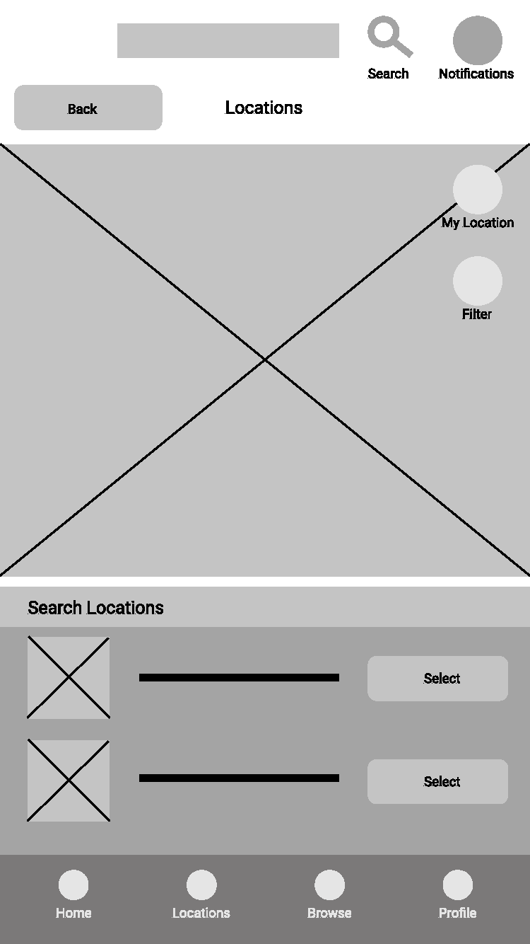
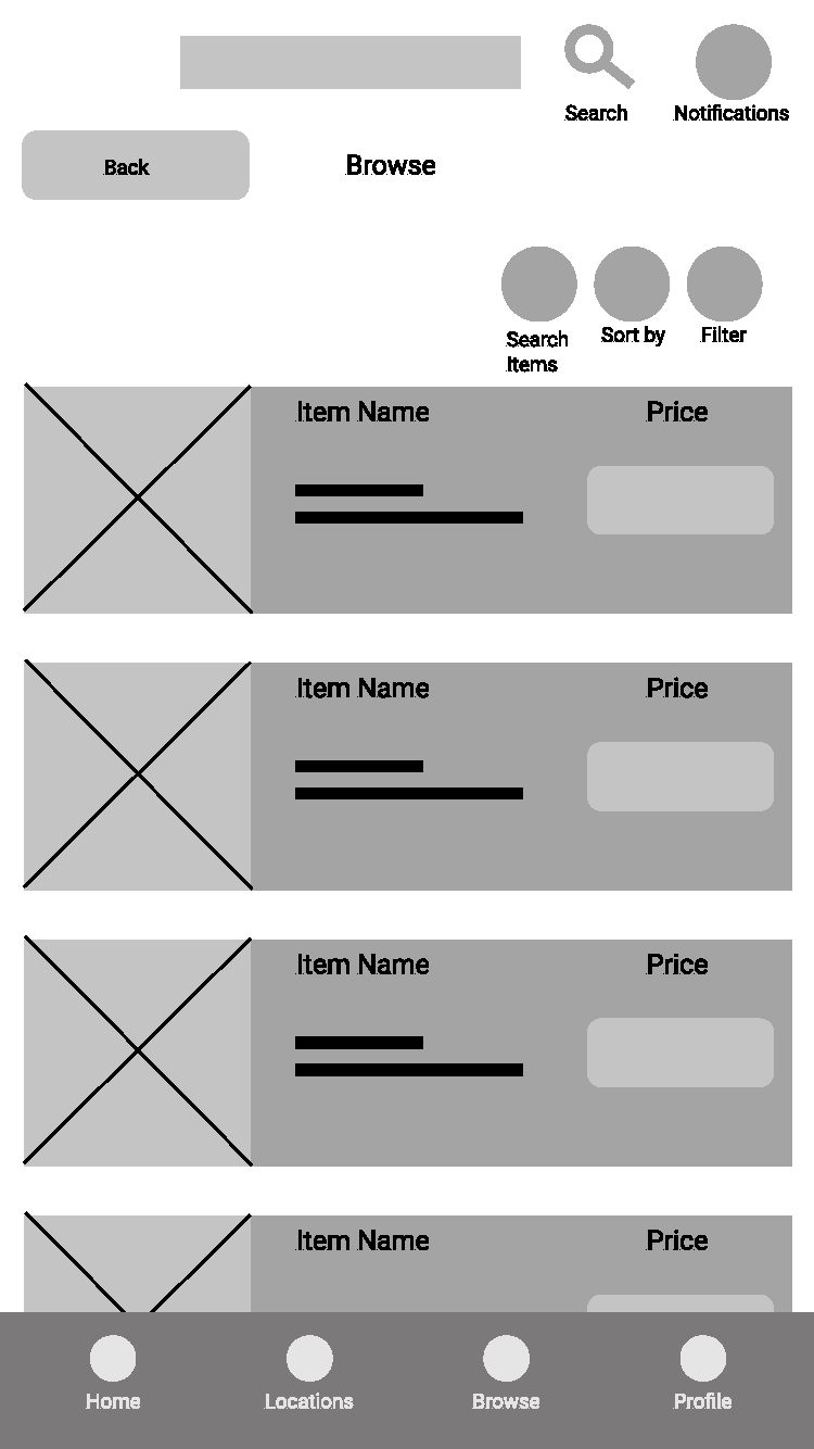
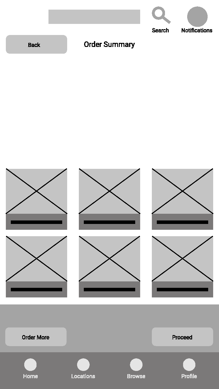
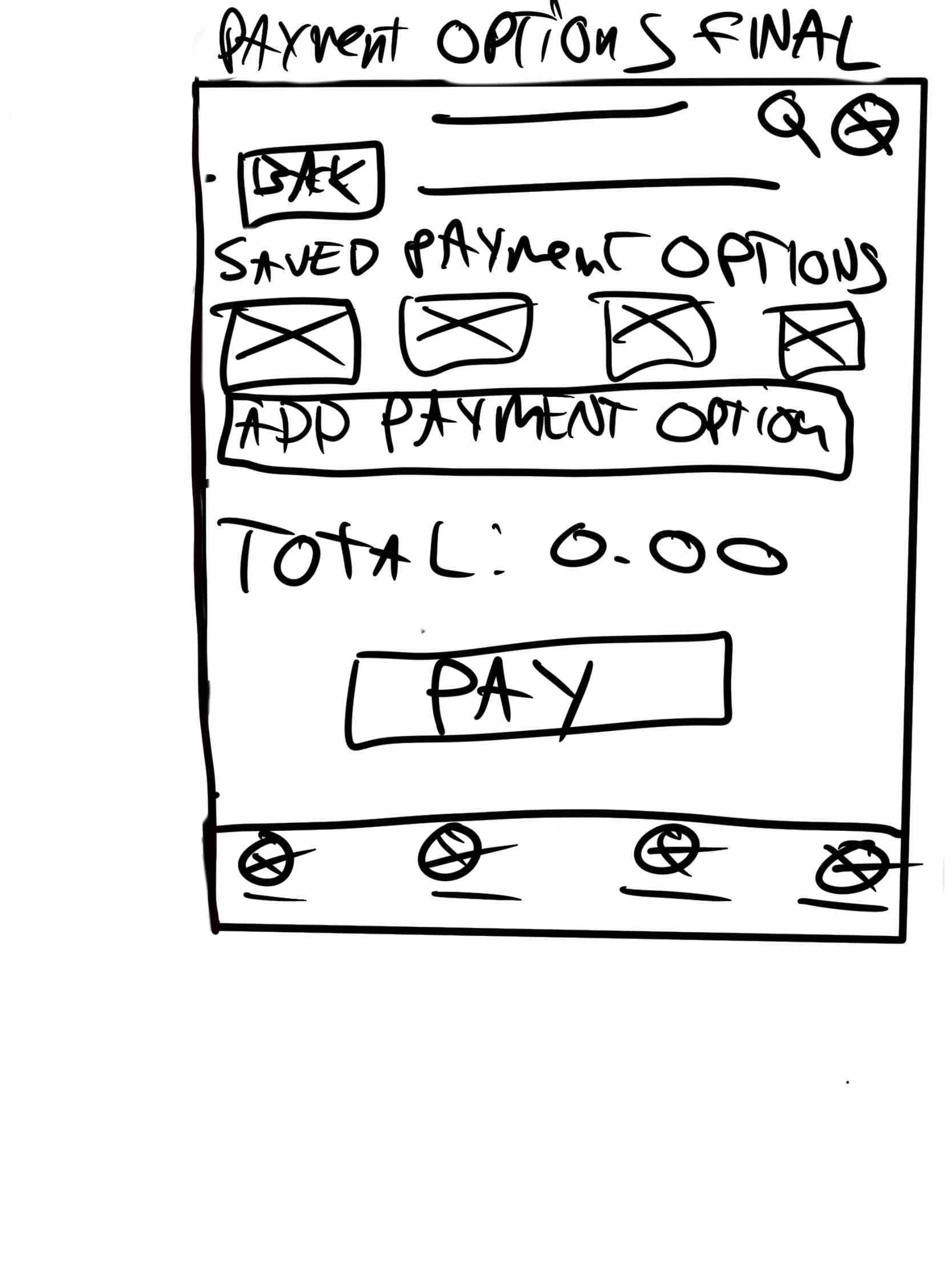
Wireframing was next which was the piece I was most excited for as a designer as I could start developing visuals for the app. First was hand drawn/paper wireframes, because of my digital workflow and preference I hand drew these via my iPad with the Apple pencil on Procreate. The slideshow reel below shows the different versions I came up with a final version which would be made in Figma. The majority I had came up with roughly 5 different ideas apart from the location page which only has 3 (Which has a naming error). You will find 5 pages; Homepage, browse, Order Summary, and Payment Options.


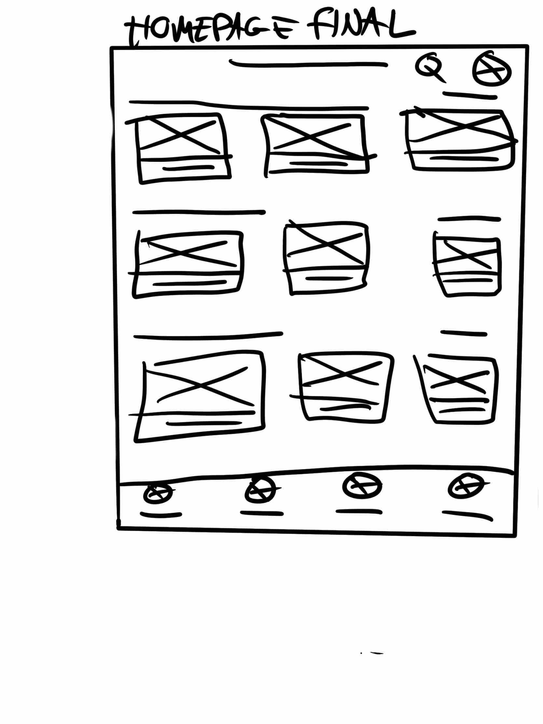
LO-FI Wireframes (Digital)
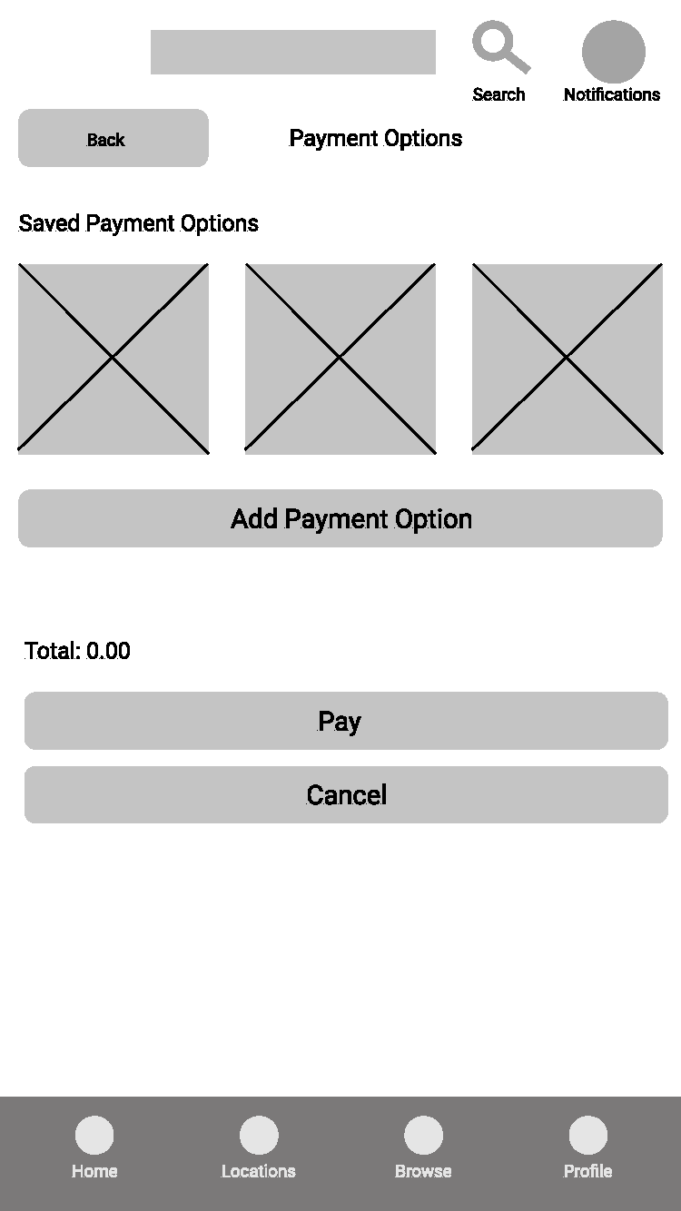
Next was converting those hand-drawns into digitally made ones. You will find the same 5 pages; Homepage, browse, Order Summary, and Payment Options. I have included the final hand-drawn with the digital so you can see the difference/development.


LO-FI Prototype
After creating the lo-fi wireframes the next step in the project was to create a prototype within Figma so we could see how the pages work together just like how it should in the final product and we can see if there are any issues or other things I haven’t thought of. Physically going through an app has a better indication if you are missing pages, features or icons than going through the app like any user would on your phone. This will have issues that will be sorted out later on. You can try the prototype yourself below.
UX Research Study Plan
The next segment of the project was a UX research study plan. The aim was to create a document outlining what the project was about and a research goal where the app will be tested in its current lo-fi format. This plan would also include the research questions going to be used during the test, KPI’s, methodology, the participants and the script of the test. You can find this document below.
Usability Study
The usability study was the test of the prototype which I did with 5 participants and gathered data based on their experience with the app. As the tests were being conducted notes were taken for each prompt and action that each person used to better understand what the feedback was and how clear everything was. This data was put on a spreadsheet and an affinity diagram to display the results.
Pattern / Theme Identification
Now we have the data from the usability study we can start identifying themes and patterns in simple statements to make it easier to implement changes which is in the document below.
Research Report Presentation
Next was to take the information that was gathered, put it into a presentation format so it can easily digested, adjust the wireframes based on the insights within this presentation and add them into the presentation. The presentation below has all these steps included which can be found below.

